Titles that we didn't like
|
|
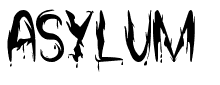
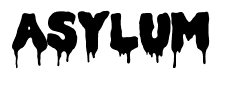
These images above are just some of the examples we are showing of the title fonts that we tried using in our opening title sequence but we decided we didn't like them. The example on the left is simple and boring, this is partly the reason why we didn't like the font. We also didn't like it because we thought it wasn't fitting in with what we had put together.
The example on the right, we thought looked more like the font off of the title in the movie 'Scream', this is because of how bulky it looks along with the dripping effect added to the bottom of the letters. To us this reminds us of blood and gory, this is one of the reason as to why we didn't pick this as our title font because our opening sequence has no blood or gore involved with it.
The example on the right, we thought looked more like the font off of the title in the movie 'Scream', this is because of how bulky it looks along with the dripping effect added to the bottom of the letters. To us this reminds us of blood and gory, this is one of the reason as to why we didn't pick this as our title font because our opening sequence has no blood or gore involved with it.
Titles we liked, but didn't use.
|
|
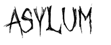
Due to not using or liking the fonts at the top of the page, we decided that we needed to look for other fonts that we preferred and thought fitted in well with our opening title sequence. The image on the left reminds us scratching, which can refer to people with mental health issues. We thought that this font connected well with our opening sequence because of how it all revolves around a mental asylum with mental people.
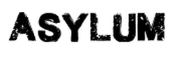
The font on the right we liked as it was simple but bold, meaning that it stood out which meant it was easier for the audience to read the titles. Also we thought that it looked like a crime font, which we thought would fit better.
The font on the right we liked as it was simple but bold, meaning that it stood out which meant it was easier for the audience to read the titles. Also we thought that it looked like a crime font, which we thought would fit better.
